AZ construções
Construction Execution
Detail
2023 – Marketeria
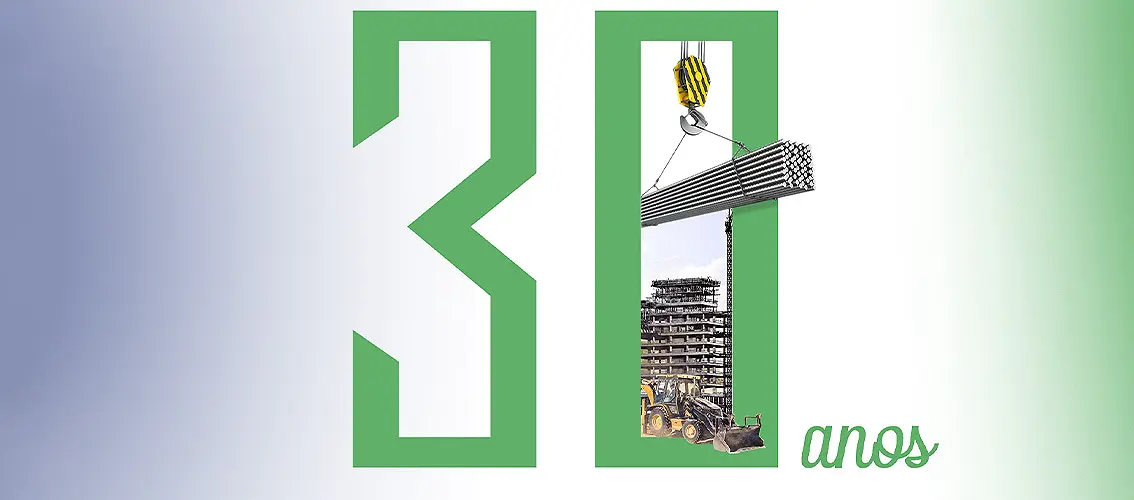
Modernize the identity of a construction company with more than three decades of experience in public works and tenders.
After thirty years of tradition, the company faced the complex challenge of reinventing itself, seeking modernity without losing its essence.
The redesign focused on creating a unique and imposing symbol, maximizing the potential of the letters ‘A’ and ‘Z’, with the use of negative space and a custom typography.
This transformation reflects not only a visual change but also a new era of innovation and progress for the company, bringing the letters to life and incorporating the concept of projects delivered from beginning to end, symbolized by the first and last letters of the alphabet.